ShopDreamUp AI ArtDreamUp

Deviation Actions


Suggested Deviants


Suggested Collections


![Anastasia [Art Trade]](https://images-wixmp-ed30a86b8c4ca887773594c2.wixmp.com/f/f7d08705-f4a5-4324-b078-4f7ff47058b7/d7s3xcz-9a7b5d33-8be2-491c-827b-ff2938e37fca.png/v1/crop/w_184,h_184,x_56,y_0,scl_0.13040396881644,q_70,strp/anastasia__art_trade__by_aste_ras_d7s3xcz-92s-2x.jpg?token=eyJ0eXAiOiJKV1QiLCJhbGciOiJIUzI1NiJ9.eyJzdWIiOiJ1cm46YXBwOjdlMGQxODg5ODIyNjQzNzNhNWYwZDQxNWVhMGQyNmUwIiwiaXNzIjoidXJuOmFwcDo3ZTBkMTg4OTgyMjY0MzczYTVmMGQ0MTVlYTBkMjZlMCIsIm9iaiI6W1t7ImhlaWdodCI6Ijw9MTQxMSIsInBhdGgiOiJcL2ZcL2Y3ZDA4NzA1LWY0YTUtNDMyNC1iMDc4LTRmN2ZmNDcwNThiN1wvZDdzM3hjei05YTdiNWQzMy04YmUyLTQ5MWMtODI3Yi1mZjI5MzhlMzdmY2EucG5nIiwid2lkdGgiOiI8PTMxNDQifV1dLCJhdWQiOlsidXJuOnNlcnZpY2U6aW1hZ2Uub3BlcmF0aW9ucyJdfQ.yu9XKDLDHhHbWfWl8GrT4G7tQYqW4_z0gBpCuVLDnwE)
![Anastasia [Art Trade]](https://images-wixmp-ed30a86b8c4ca887773594c2.wixmp.com/f/f7d08705-f4a5-4324-b078-4f7ff47058b7/d7s3xcz-9a7b5d33-8be2-491c-827b-ff2938e37fca.png/v1/crop/w_92,h_92,x_28,y_0,scl_0.065201984408221,q_70,strp/anastasia__art_trade__by_aste_ras_d7s3xcz-92s.jpg?token=eyJ0eXAiOiJKV1QiLCJhbGciOiJIUzI1NiJ9.eyJzdWIiOiJ1cm46YXBwOjdlMGQxODg5ODIyNjQzNzNhNWYwZDQxNWVhMGQyNmUwIiwiaXNzIjoidXJuOmFwcDo3ZTBkMTg4OTgyMjY0MzczYTVmMGQ0MTVlYTBkMjZlMCIsIm9iaiI6W1t7ImhlaWdodCI6Ijw9MTQxMSIsInBhdGgiOiJcL2ZcL2Y3ZDA4NzA1LWY0YTUtNDMyNC1iMDc4LTRmN2ZmNDcwNThiN1wvZDdzM3hjei05YTdiNWQzMy04YmUyLTQ5MWMtODI3Yi1mZjI5MzhlMzdmY2EucG5nIiwid2lkdGgiOiI8PTMxNDQifV1dLCJhdWQiOlsidXJuOnNlcnZpY2U6aW1hZ2Uub3BlcmF0aW9ucyJdfQ.yu9XKDLDHhHbWfWl8GrT4G7tQYqW4_z0gBpCuVLDnwE)


You Might Like…


Featured in Groups
Description
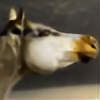
Really wanted to push myself on something and this had been an idea floating around in my head for a while. Might try a few other birdies now  (Smile) - :)")
Entered in the Birds of a Feather contest here -> [link]
Horse -
Background -
Cardinal - jmacphoto.com@flickr
Entered in the Birds of a Feather contest here -> [link]
Horse -
Background -
Cardinal - jmacphoto.com@flickr
Image size
2041x2523px 2.38 MB
Comments30
Join the community to add your comment. Already a deviant? Log In
Well, let's see!
First of all, I love the colors in this: how the background has that vivid, orangey color and the foreground is almost emerald green. I love the idea and the composition. I love how you blurred everything but the log and the horse.
The mane is a bit weird, the mane in special because part of it is turning forward and part of it backwards - it's just... now flowing properly, I don't exactly know why. Also, the forelock's position makes no sense: it's going up and backwards for no apparent reason - it'd be best if it curled around the ear, maybe part of it folding back, but not right up like that. I like what you did with the wings, but there's something else vaguely disturbing me and it's the white lines you've (apparently) sketched over it: they're too clear, too visible, and actually detract rather than add. I think it'd look better without them. They aren't visible even in full view, but I clicked download to see the details, and then I realized what was bugging me. In special, the outline near the wing (where it blends into the muscle) actually makes it appear a bit fake, whereas without it it'd be very well blended.
The cardinal marking is very well done - it adds to it, which is awesome.
All in all, very good work - certainly my favorite in your gallery <img src="e.deviantart.net/emoticons/s/s…" width="15" height="15" alt="